ЧАбд
дкШеГЃЕФПЊЗЂжаЃЌUIЮЊСЫШУНчУцИќМгЮќв§ШЫЭљЭљЛсдкНчУцЩЯгУЕНДѓСПЕФНЅБфЩЋЁЃФЧУДдкБОЮФжаЃЌЮвУЧНЋЭЈЙ§МИИіАИР§ИќКУЕФШЅСЫНтFlutterжаНЅБфЩЋЕФЪЙгУЁЃШУЮвУЧПЊЪМЬНЫїFlutterЪРНчжабЄРіЖрВЪЕФНЅБфЩЋаЇЙћАЩЃЁ
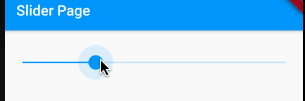
АИР§вЛЃКНЅБфЩЋБпПђ
КмЖрЪБКђЃЌвЛИіМђЕЅЕФБпПђВЂВЛФмТњзуЮвУЧЖдгкНчУцЕФУРИавЊЧѓЁЃЮвУЧЯЃЭћИјБпПђдіЬэвЛаЉЬиЪтЕФаЇЙћЃЌШУЫќИќМгв§ШЫзЂФПКЭЖРЬиЁЃЖје§ЪЧдкетжжЧщПіЯТЃЌНЅБфЩЋБпПђГЩЮЊСЫвЛИіКЯЪЪЕФбЁдёЁЃдкFlutterжаЃЌЪЕЯжНЅБфЩЋБпПђЕФЗНЪНгаКмЖрЃЌгаМђЕЅЕФЃЌгаИДдгЕФЁЃзюМђЕЅЕФЪЕЯжЗНЪНФиОЭЪЧЭЈЙ§СНИіContainerЕФЕўМгЃЌР§ШчЃК
Container(
height: 48,
width: 280,
padding: const EdgeInsets.all(2),
decoration: BoxDecoration(
borderRadius: BorderRadius.circular(30),
gradient: const LinearGradient(
colors: [Colors.blue, Colors.red],
)),
child: Container(
alignment: Alignment.center,
decoration: BoxDecoration(
borderRadius: BorderRadius.circular(30),
color: Colors.white,
),
child: const Text(
'НЅБфЩЋ ЁЊ Taxze',
style: TextStyle(
fontSize: 20,
fontWeight: FontWeight.bold,
color: Colors.black,
),
),
),
),
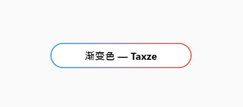
жЛашвЊИјЭтВуContainerМгЩЯLinearGradientНЅБфЩЋЃЌШЛКѓМгЩЯвЛИіpaddingЃЌетИіpaddingОЭЪЧБпПђЕФДжЯИЃЌШЛКѓНЋФкВПЕФContainerБГОАЩшжУЮЊАзЩЋМДПЩЁЃетжжЗНЪНЗЧГЃМђЕЅЁЃ
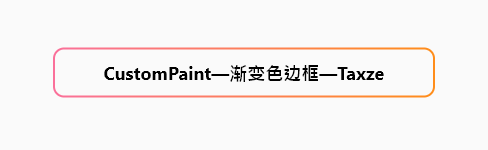
ЕЋЪЧетжжЗНЪНФиВЛЙЛСщЛюЃЌгаОжЯоадЃЌЖјЧвПЩЖЈжЦадЪмЯоЃЌЮоЗЈЖдУПИіБпПђЕФНЅБфНјааЖРСЂЩшжУЁЃЫљвдЖдгкБпПђЕФНЅБфЃЌИќЭЦМіЪЙгУCustomPainterРДНјааЛцжЦЁЃ
class GradientBoundPainter extends CustomPainter {
final List<Color> colors;
final double width;
final double height;
final double strokeWidth;
const GradientBoundPainter({
Key? key,
required this.colors,
required this.width,
required this.height,
this.strokeWidth = 2.0,
});
@override
void paint(Canvas canvas, Size size) {
//ЖЈвхОиаЮЕФПэИп
final rectWidth = width, rectHeight = height;
//дВНЧЁЃБивЊЕФЛАПЩвдНЋЦфзїЮЊБфСПДЋНјРД
final radius = 10.0;
//ЖЈвхОиаЮЕФЮЛжУКЭГпДч
Rect rect = Offset(
size.width / 2 - rectWidth / 2, size.height / 2 - rectHeight / 2) &
Size(rectWidth, rectHeight);
//RRect.fromRectAndRadiusвЛИіОпгадВНЧЕФОиаЮ
RRect rRect = RRect.fromRectAndRadius(rect, Radius.circular(radius));
//ЛцжЦ
final paint = Paint()
//ДДНЈЯпадНЅБфзХЩЋЦї
..shader = LinearGradient(
begin: Alignment.centerLeft,
end: Alignment.centerRight,
colors: colors,
).createShader(rect)
..strokeWidth = strokeWidth
//жЛЛцжЦБпПђЖјВЛЬюГф
..style = PaintingStyle.stroke;
canvas.drawRRect(rRect, paint);
}
@override
bool shouldRepaint(covariant GradientBoundPainter oldDelegate) {
return oldDelegate.colors != colors;
}
}
ЪЙгУЦ№РДвВКмМђЕЅ
Container(
width: 200,
height: 48,
child: LayoutBuilder(
builder: (BuildContext _, BoxConstraints bc) {
return CustomPaint(
painter: GradientBoundPainter(colors: [
const Color(0xFFFA709A),
const Color(0xFFFF8D1A),
], width: bc.maxWidth, height: bc.maxHeight),
// child: SizedBox(),
);
},
),
);
АИР§ЖўЃКTabBarНЅБфЩЋжИЪОЦї
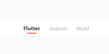
TabBarдкПЊЗЂжаЪЧвЛжжГЃгУЕФзщМўЃЌгУгкЧаЛЛВЛЭЌЕФФкШнЛђЙІФмФЃПщЁЃЖјЮЊСЫдіЧПБъЧЉРИЕФПЩЪгаЇЙћЃЌШУгУЛЇдкНчУцЧаЛЛЪБЛёЕУИќМгСїГЉКЭв§ШЫзЂФПЕФЬхбщЃЌЪаУцЩЯЕФИїДѓappЛљБОЩЯЖМЖдTabBarЕФжИЪОЦїindicatorзіСЫЬиЪтЛЏЁЃЖјFlutterздДјЕФЖдindicatorбљЪНаоИФОЭФЧУДМИжжЃЌИљБОВЛЙЛгУАЁЃЈСЌИФИіГЄЖШЖМвЊздМКздЖЈвхЃЉЁЃФЧУДдкетИіАИР§жаЃЌЮвУЧОЭРДбаОПЯТЃЌШчКЮздЖЈвхЛцжЦвЛИіНЅБфЩЋЕФindicatorЁЃ
indicatorашвЊвЛИіDecorationЖдЯѓЃЌЫљвдЮвУЧЪзЯШашвЊМЬГагкDecoration
class CustomTabIndicator extends Decoration {
}
КЫаФЛцжЦТпМШчЯТ
@override
BoxPainter createBoxPainter([VoidCallback? onChanged]) {
return _UnderlinePainter(this, onChanged);
}
///ОіЖЈПижЦЦїПэЖШЕФЗНЗЈ
Rect _indicatorRectFor(Rect rect, TextDirection textDirection) {
assert(rect != null);
assert(textDirection != null);
final Rect indicator = insets.resolve(textDirection).deflateRect(rect);
// ЯЃЭћЕФПэЖШ
double wantWidth = this.width;
// ШЁжаМфзјБъ
double cw = (indicator.left + indicator.right) / 2;
//етРяЪЧКЫаФДњТы
//ЯТЛЎЯпППзѓ
// return Rect.fromLTWH(indicator.left,
// indicator.bottom - borderSide.width, wantWidth, borderSide.width);
//ЯТЛЎЯпОгжа
return Rect.fromLTWH(cw - wantWidth / 2,
indicator.bottom - borderSide.width, wantWidth, borderSide.width);
}
@override
Path getClipPath(Rect rect, TextDirection textDirection) {
return Path()..addRect(_indicatorRectFor(rect, textDirection));
}
class _UnderlinePainter extends BoxPainter {
_UnderlinePainter(this.decoration, VoidCallback? onChanged)
: assert(decoration != null),
super(onChanged);
final CustomTabIndicator decoration;
///ОіЖЈПижЦЦїБпНЧаЮзДЕФЗНЗЈ
@override
void paint(Canvas canvas, Offset offset, ImageConfiguration configuration) {
assert(configuration != null);
assert(configuration.size != null);
final Rect rect = offset & configuration.size!;
final TextDirection textDirection = configuration.textDirection!;
//ЕїгУ decoration._indicatorRectFor(rect, textDirection) ЗНЗЈМЦЫуГіжИЪОЦїЕФЮЛжУКЭГпДчЃЌ
//ВЂЪЙгУ deflate ЗНЗЈЫѕаЁОиаЮЕФДѓаЁЃЌвдБуНЋБпПђЕФвЛАыАќКЌдкОиаЮФкЁЃ
final Rect indicator = decoration
._indicatorRectFor(rect, textDirection)
.deflate(decoration.borderSide.width / 2.0);
final gradient = LinearGradient(
colors: [Color(0xFFFA709A), Color(0xFFFF8C1A)],
begin: Alignment.centerLeft,
end: Alignment.centerRight,
);
final Paint paint = decoration.borderSide.toPaint()
..shader = gradient.createShader(indicator)
..strokeCap = decoration.strokeCap; //етПщИќИФЮЊЯывЊЕФаЮзД
canvas.drawLine(indicator.bottomLeft, indicator.bottomRight, paint);
}
}
ЪЙгУЦ№РДвВКмМђЕЅЃК
TabBar(
controller: controller,
indicator: const CustomTabIndicator(),
...
),
вдЯТЪЧвЛаЉгаШЄЕФР§зг
АИР§Ш§ЃКНЅБфЩЋБЌеЈСЃзг
вЛИіЛсЫцМДЩњГЩ30ИіБЌеЈаЇЙћЕФНЅБфЩЋСЃзгЁЃ
ЪЕЯжЦ№РДвВКмМђЕЅЃЌвдЯТЪЧКЫаФЕФЩњГЩТпМЃК
//ЭЈЙ§ЖЈЪБЦїЕїгУЩњГЩСЃзгЕФКЏЪ§
_timer = Timer.periodic(Duration(milliseconds: 500), (_) {
_explode();
});
//ЫцЛњЩњГЩСЃзг
void _explode() {
final random = Random();
_particles.clear();
for (int i = 0; i < 30; i++) {
final particle = Particle(
//беЩЋ
color: _colors[random.nextInt(_colors.length)],
//НЧЖШ
angle: random.nextDouble() * 2 * pi,
//ОрРы
distance: random.nextDouble() * 120,
//ДѓаЁ
size: random.nextDouble() * 8 + 2,
//а§зЊНЧЖШ
rotation: random.nextDouble() * 2 * pi,
);
_particles.add(particle);
}
setState(() {});
}
//фжШО
for (final particle in _particles)
Positioned(
//ШЗЖЈСЃзгдкЦСФЛЩЯЕФОпЬхЮЛжУ
left: particle.distance * cos(particle.angle) +
MediaQuery.of(context).size.width / 4,
top: particle.distance * sin(particle.angle) +
MediaQuery.of(context).size.height / 5,
//ПижЦСЃзгЕФа§зЊ
child: Transform.rotate(
angle: particle.rotation,
child: Container(
width: particle.size,
height: particle.size,
decoration: BoxDecoration(
shape: BoxShape.circle,
gradient: RadialGradient(
colors: [
particle.color.withOpacity(1.0),
particle.color.withOpacity(0.0),
],
),
),
),
),
),
АИР§ЫФЃКНЅБфЩЋМгдижИЪОЦї
ЭЈЙ§AnimationКЭAnimationControllerРДПижЦа§зЊКЭбеЩЋЕФБфЛЏЁЃ
КЫаФТпМ
//НЋЖЏЛПижЦЦїгыбеЩЋЙ§ЖЩЖЏЛНјааЙиСЊ
_animation = _animationController.drive(
ColorTween(
begin: Colors.red,
end: Colors.purple,
),
);
AnimatedBuilder(
animation: _animationController,
builder: (BuildContext context, Widget? child) {
return Transform.rotate(
//ПижЦа§зЊ
angle: _animationController.value * 2 * pi,
child: Container(
...
decoration: BoxDecoration(
shape: BoxShape.circle,
//ПижЦНЅБф
gradient: LinearGradient(
colors: [
_animation.value!,
_animation.value!.withOpacity(0.5),
],
begin: Alignment.topLeft,
end: Alignment.bottomRight,
),
),
child: Icon(...),
),
);
},
),
змНс
дкБОЦЊЮФеТжаЃЌЮвУЧЬНЬжСЫМИИіFlutterжаНЅБфЩЋЕФЯрЙиАИР§ЁЃFlutterЬсЙЉСЫЗсИЛЕФНЅБфЩЋжЇГжКЭСщЛюЕФЖЈжЦбЁЯюЃЌЪЙЮвУЧФмЙЛЧсЫЩЪЕЯжИїжжИїбљЕФНЅБфЩЋаЇЙћЁЃЮоТлЪЧгУгкБГОАЁЂЮФБОЁЂЭМБъЛЙЪЧБпПђЃЌНЅБфЩЋЖМФмЮЊгІгУГЬађДјРДЩњЖЏЁЂЖрбљКЭЮќв§ШЫЕФЪгОѕаЇЙћЁЃЯЃЭћБОЦЊЮФеТЖдФуРэНтКЭдЫгУFlutterжаЕФНЅБфЩЋЯрЙиФкШнгаЫљАяжњЃЌМЄЗЂФуЕФДДдьСІ~